___________________________________________________________
WHAT DOES THE COVER REALLY SAY?
We've talked extensively about magazine covers in semester 3 so during this class I'd like to focus more on book covers and what they can hint at before the book is even opened. Put yourself in the mind of the bookstore consumer, I'm sure you've been one yourself more than a few times. There is a ton of books to catch your eye and yes, people do judge a book by it's cover. Booktech Magazine says "More books are being produced than ever before. That's good - and bad. If you're a book buyer, the choices seem to be limitless. But if you're a book publisher, that means the competition for readers' eyes and wallets is keen."


What makes you pick one up? True it should probably be on your topic of choice, but what does a cover have to do to get your attention. Lets have a look at some examples and see what they imply on the cover.
This is quite a nice example by Michael Dorrian and Liz Farrelly for their book about Business Card Design. Firstly the name works really well - Designs on Saying Hello - because that's basically what a business card does. Secondly their grid sets up a nice graphic visual that shows the diversity available. Book available from Laurence King Publishing.


Back and front of Daniel Eatock's book Imprint. The cover consists of a thumbprint made up of all his reasons for designing and the spine carries an actual inked thumbprint of his. Yep, he did every single spine by inking up his thumb and then placing it on the spine. Check out the video here for proof. That's dedication, I don't know what the print run was but you've got to assume, for a worldwide book, it's at least 5000...probably more. Check out his site he has some amazing art projects he's started.


Okay now lets have a quick look at a bunch of titles from Laurence King Publishing (really I'm not working for them - they just have some good examples that help explain cover concept - books are linked via clicking on the pictures). Look at how all these cover images link directly to the books content - this is what we need to try and do with our book covers.


These are all pretty obvious examples. What about ones that are not so easy. What do these ones say about the artist/designer/studio?
Front cover for FUEL, Back and front cover for Phunk Studio and front cover for Misprinted Type.


Every image you put onto the cover will be instantly associated with what's inside. It's up to you as the designer to make sure that the image message and the inside message marry or make sense. Fuel creates a sense of being well read and learned by showing themselves made from books. Phunk Studio create a very different feel about their work inside just by having such a suggestive cover. What does Eduardo Recife (Misprinted Type) suggest with his cover?
___________________________________________________________
THE SPINE OF DESIGN by John D. Berry


The next question to tackle is how to help the book when it's on the bookshelf. In this case you can only see the spine and have considerably less space to design in. The beautiful, dramatic cover, where great effort and expense weren't spared, never gets seen if a browsing book buyer doesn't reach out and pull the book off the shelf.
Sometimes the book might be fat enough to allow you to design the spine horizontally, so that the words are the right way up when viewed by the browser's eye. In most cases the spine is not thick enough to allow large enough type size, the type instead is turned at right angles to the viewer's eye, in order to run along the vertical spine.
In North America, the normal direction is from top to bottom; in Europe, it's usually bottom to top. (This means that in North America, in a pile of books stacked face up, all the titles are easy to read; in Europe, it's the pile of books stacked face down, with no front covers visible at all, where the titles on the spines are easy to read. The biggest practical effect is that readers browsing the shelves in a European bookstore crick their necks to the left, while those in North America crick theirs to the right.)
Since the type is not aligned with the way we normally read, it has to be even clearer than it would otherwise. Crowded, cramped type gets lost in the clutter. No matter what the front cover looks like, capital letters make the best use of the narrow spine (no ascenders or descenders to extrude into the limited space). A little extra space between the letters -- even more than you'd give them in a horizontal line -- helps them stand out and be read. Read more.
___________________________________________________________
BARCODE, PRICING & ISSUE #
What to say about barcodes - you have to have them if you want to sell anything in the western world. I know it wrecks the whole cover, makes it look commercial, contrasts with the base colour - believe me I've heard them all but the fact is - if your magazine is being sold you best put a barcode on it - it's the law!
Normally this is a good chance to also get your price, issue number/month and contain them in one nice vehicle along with your barcode. You could even put your mother logo in there so everyone knows who published this fine piece of media - like Frankie does:

Nicely hidden down the side.

Magazine codes must go on the front and be quickly scanable (piss off the newsagent and they'll stop ordering you - unless you're a big seller and then you can do whatever the hell you like.) Distributers have a lot of say as well and could refuse to distribute your book if get too arty. Books and mooks can have their code on the back and not worry so much about how scanable it is (still worth making it as easy as possible for the seller.)
If it's being sold in other countries you'll need to put them on there as well. Of course you could print a new cover for each country but that's going to cost you. Of course you'll need to say whether it includes GST or not. Rush does a nice job of saying the bare minimum:

And hides down in the corner we are most likely to miss.

Wallpaper* uses their countries prices as a way to show off how big they are.

Of course there are magazines who like to make the barcode part
of their artwork - this is fine to do as long as the newsagent can find it easily.

___________________________________________________________
HOMEWORK
You should aim to have three different names for next week, try to get a one word name, an affiliation and an acronym. To each of these names you should attribute a rationale (explanation of what it means, where it comes from.) In class we'll discuss them and work out which one works best.
___________________________________________________________
INSPIRATION & EXTRAS
Each week I throw up things I find that relate to what we've been discussing or working on that week. Sometimes it might be things that relate to your major assessment and sometimes just stuff I thought was worth seeing. If you find something you think we should be showing or something we just have to see let us know in class or throw an email over to me at matt@billyblue.com.au and I'll get it up here or on the Bluni inspiration site.
___________________________________________________________
PREVIOUS EXAMPLES


___________________________________________________________
UNICEF Water
Recently Casanova Pendrill NY, was given the chance to create a unique awareness campaign for UNICEF. The brief was to make the average New Yorker aware of the safe water plight in developing countries and get them to donate. The problem - no budget. Great idea and so far it has been really well received getting loads of media coverage.
Text on the machine says: “Thirsty? So are millions of people around the world with no access to clean drinking water. 4,200 children die of water-related diseases everyday. Help provide safe drinking water to developing countries. Donate today. You wouldn’t drink dirty water. No one should. Donate now by texting TAP to 864233 (UNICEF) or visit tapproject.org. Just a dollar provides a child with 40 days of clean drinking water.”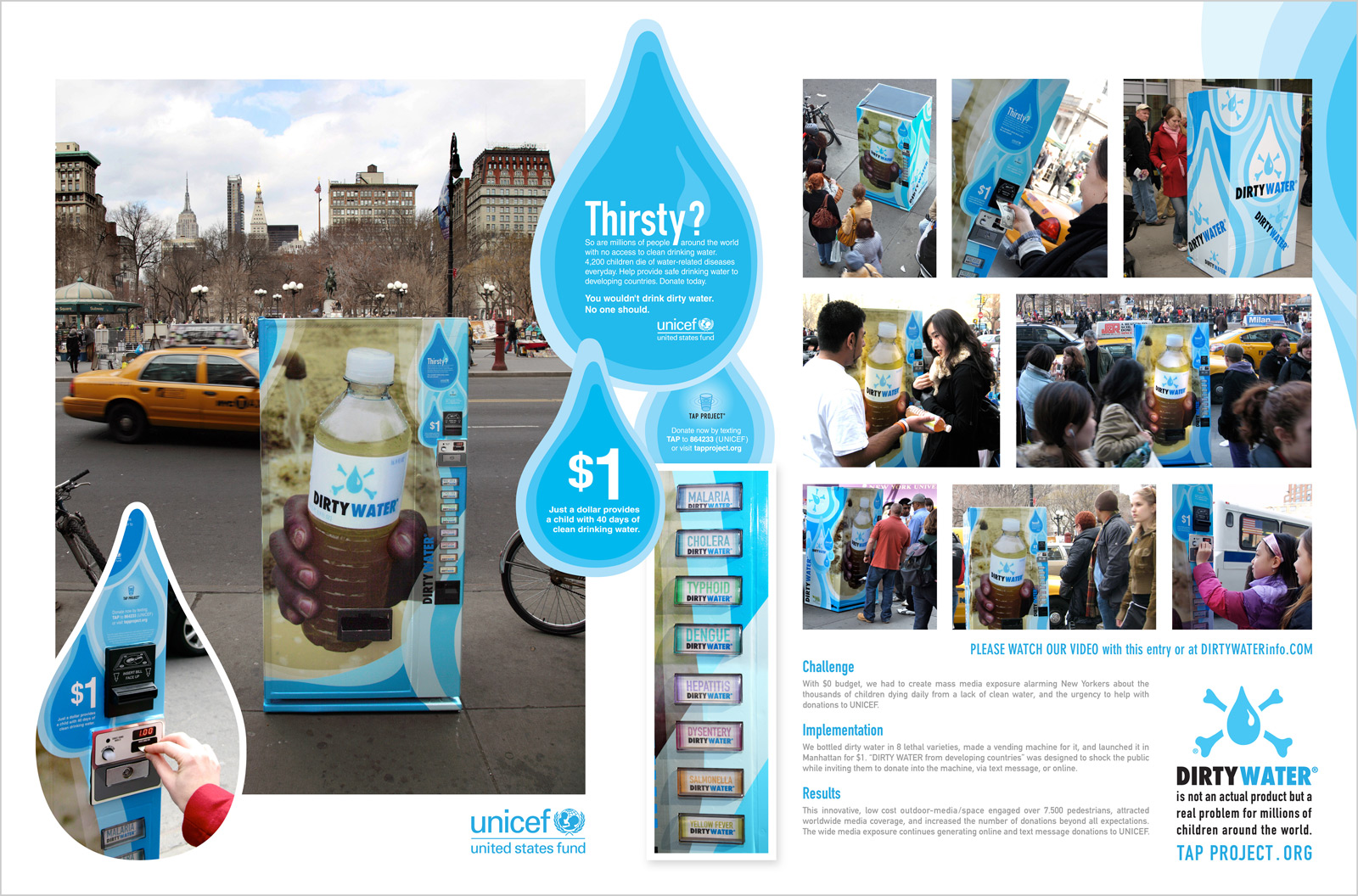
___________________________________________________________
Al Ries - The Power of the Name
More Al Ries, because I can never get enough of his enthusiasm.

